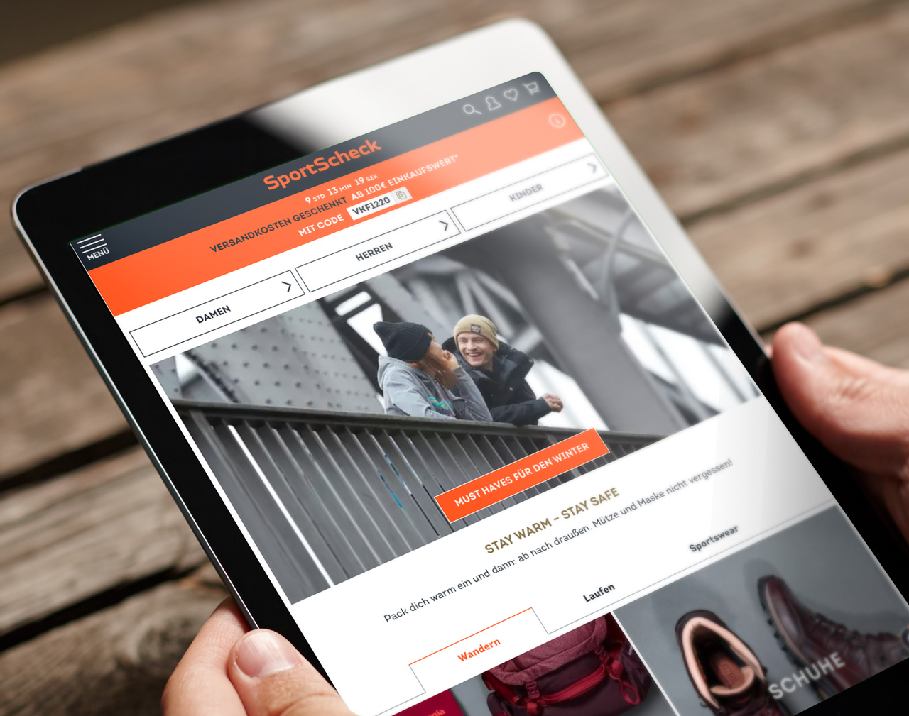
New corporate design, new user experience
This was a classic assignment for hmmh: Sportscheck had designed a new corporate identity and now asked us to translate the design basics created for print into a responsive frontend for their webshop. As a result, we not only developed the shop frontend (including a design library and framework for further Sportscheck projects), but also established a model collaboration with integrated teams across two locations.
According to Gregor Frey, Head of Webshop Development at Sportscheck, “The new layout should convey the digital sports experience and appeal to our customers emotionally and directly.” Additionally, customers should be guided perfectly through the product range and towards making a purchase on any device. The shop design should also set the standard with a living style guide for all future online projects with the new corporate design.
Existing features, new goals
All of this had to be accomplished without altering or adding any backend features to the existing Intershop installation. This was an important consideration for the design, which, as we understood it, encompasses not just how it looks, but also how it functions. The frontend assignment presented several unique challenges, including a new navigation concept, additional options for product and theme promotion, and an optimized checkout process.
Their new corporate design not only meant a different look for Sportscheck but also expressed a new culture that was more active, agile, efficient, and customer-centric. As part of the relaunch, an online project was implemented using an agile approach for the first time. They had found the right partner in hmmh.
hmmh convinced sportscheck with its expertise during the pitch. now, we can demonstrate how we can create an outstanding result together with the customer. Code and design should be created in co-creation because, in our experience, this results in outcomes that more precisely meet customer needs than frontends created in other ways.
A quick start into agile teamwork
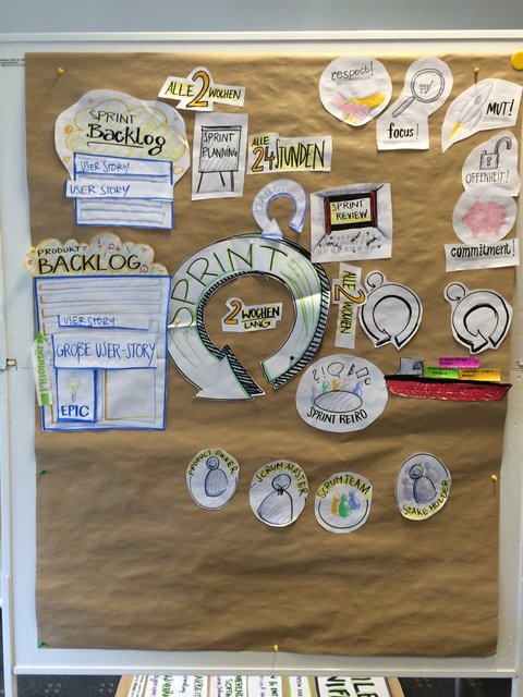
During a short but intense onboarding phase, the Sportscheck team was introduced to the methods and terminology of Scrum by experienced hmmh team members. They learned about planning, sprints, reviews, retrospectives, as well as the roles of product owners, stakeholders, and scrum masters. Together, the team practiced all the steps and roles of agile work using a sample project before moving on to the actual project. The marshmallow challenge was a new experience for many, not only for the Sportscheck team.
Right is what works: Getting results sooner with Lean Design
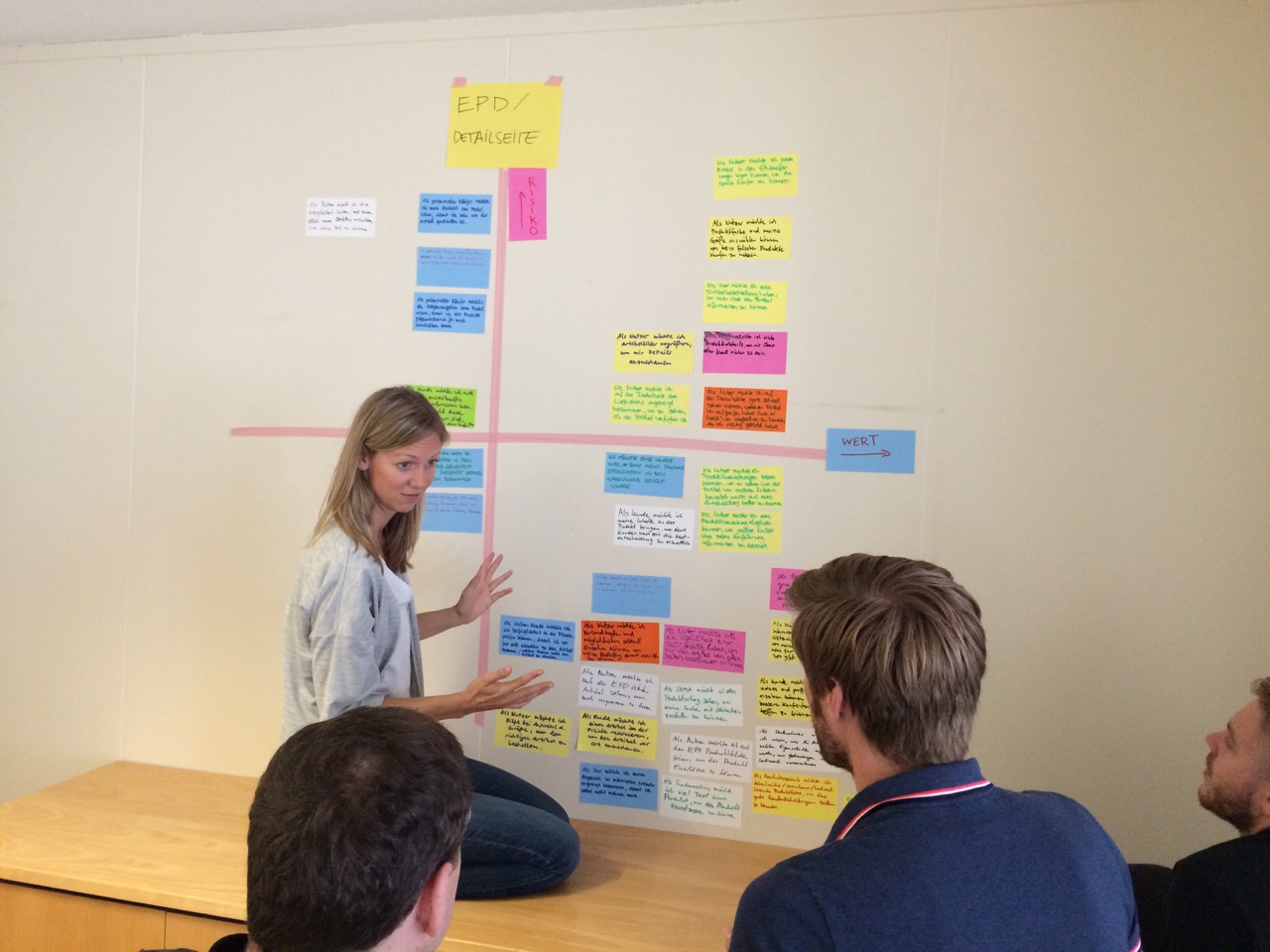
The advantage of agile work lies primarily in producing directly verifiable results and being able to react quickly to changes in the project, as well as to user feedback. To ensure that the goal remained in sight despite all the agility, the team first established the basics of the project: both general aspects, such as the success criteria from the stakeholders' point of view, and specific aspects, such as the criteria for when a task is fully described and when it is finished.
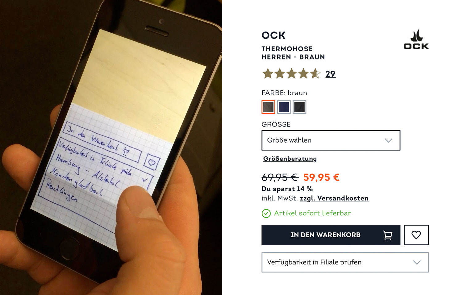
In this context, “finished” meant that the work was verifiable through testing. Because the team started designing in code after a brief sketching phase, work results could always be tested in a realistic environment with users as soon as they worked fundamentally. Repeated small changes—incremental iterations—were then based on feedback from the tests and improved the product in a validated way.
Front-end development: More success with a team that develops together
In the project, a hierarchically structured library of code modules was created based on the principle of “Atomic Design”. The tool for the library was Pattern Lab.
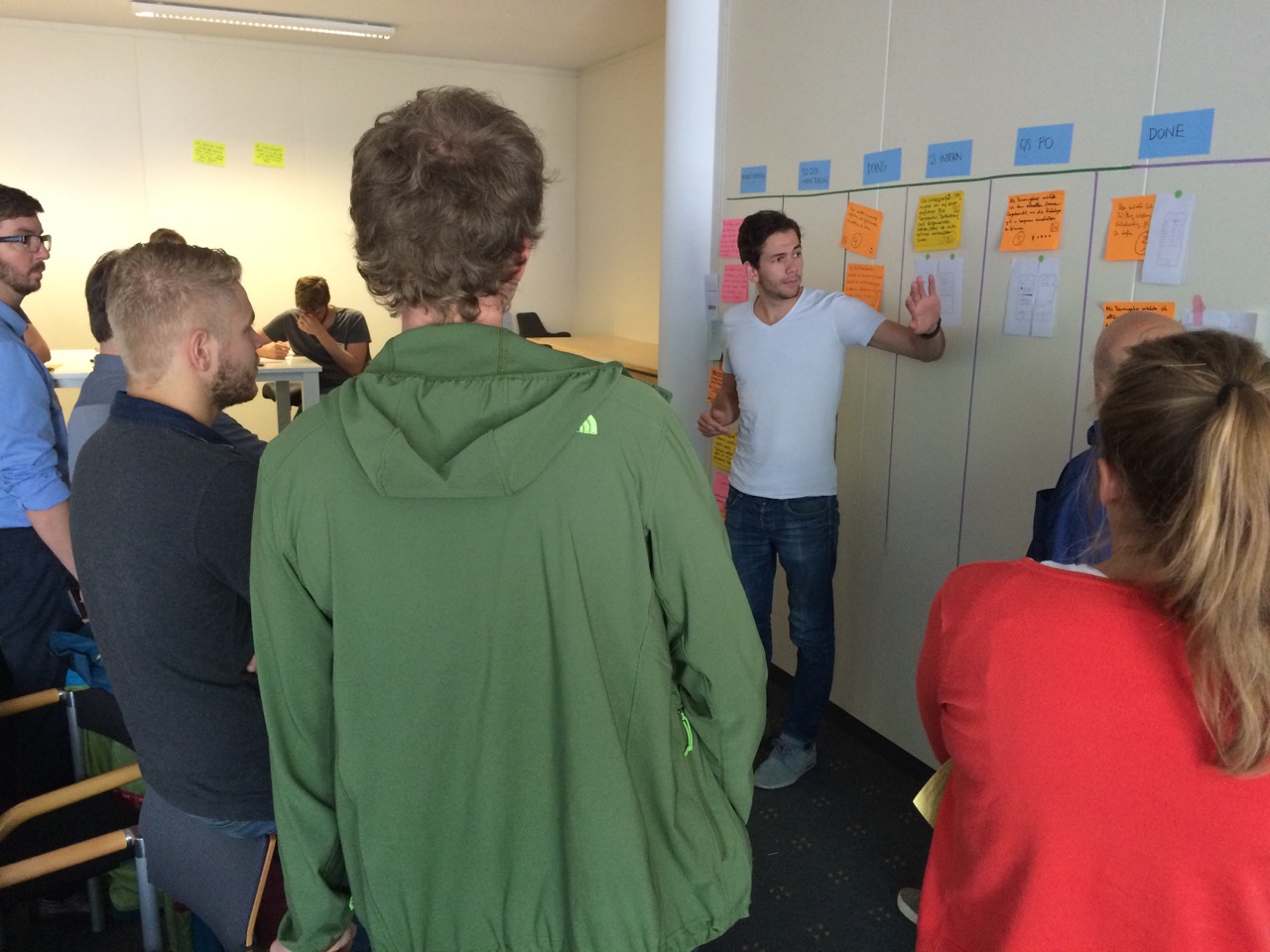
From the beginning, hmmh and Sportscheck formed a joint team for the project, which alternated between working in Unterhaching and Bremen. The desired effect occurred immediately: in quick informal exchanges, specialists on both sides learned to look beyond their own areas of expertise, acquired new skills, and thus constantly improved in their own fields—all for the benefit of the project. What we also learned: how well Northerners and Southerners can work together.
Even outside of work we could see that “Mass” and “Knipp” are quite compatible. Soccer, however, was only ever briefly discussed.
Keep going when it is at its most best: post-launch content strategy workshop.
No matter how thoroughly one tests, a shop's real performance is only evident after going live. Equipped with user data and the editors' ongoing operational experience, the frontend team met with the shop managers to jointly optimize the maintenance of the templates. New page types and new or improved modules were developed. In close collaboration, the team improved both content creation and maintenance as well as the shopping experience for customers searching for functional and fashionable sportswear.
The result: improved user guidance, more emotional appeal, and increased opportunities for the editorial team.
With the relaunch, the Sportscheck shop received more than just a new look. Visitors now experience a completely new shop on all levels: The editorial team can appropriately showcase the Sportscheck brand with newly created modules, thus emphasizing the emotional side of sports more strongly. Current topics are given more space, and visitors can navigate the assortment more intuitively and obtain better information. Micro-interactions at many points of the interface demonstrate the team's attention to detail and improve usability without negatively affecting performance. Additionally, the checkout process now runs even more smoothly.

